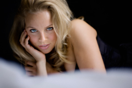
Detroit Michigan Glamour Photography Mary DuPrie
Back to reality… computer hell that is. I’ve been working on new pricing and literature for awhile (too long). I had just dragged and dropped the type yesterday and it worked just fine. Tried to do the same thing tonight, failed. I’m still playing around getting a look I want, which could be forever. Eventually I’m going to have to say yes to something. I think that pricing isn’t enough, I want some type and hype to go along with it. My goal is to redo all my pricing and have some flowery info to send out to clients. The info above is from Toronto Boudoir Photography Kathy Honeybourne.
I’ve never really understood the whole rasterize thing. I ran into that with my new literature, where it was no longer editable. I need to be able to change it as I go along.
In the past I would of paid someone to do this for me. But it seems that the more I learn the more I want to do things myself. I like the fringe benefits of learning new things, the control it gives me over my own work. This stuff never ends…

Hey Josh
Yes, you are right. I should def be using InDesign. I’m just making a flip book though for web viewing. i’ve decided to forego any printing. ( I hope I don’t regret it)
You sound like you know a lot about InDesign…next time I try it I’m going to Skype you! My brain is on overload with all this stuff.
If your running into rasterizing issues your using the wrong tool for the job. I am pretty sure I remember you mentioning something about indesign in a previous post and that is what you should be doing layout in, not photoshop or even illustrator. No issues with rasterizing in indesign, it has better output for press and it will generally make your life easier with more control. Place your background texture as an image, .psd is fine, then place the image of the model, apply the drop shadow effect in indesign, and finally create a text box and put your text in there. A good rule of thumb for body copy is to make the leading 1.5x the type size, so if the type is 10 point then the leading is 15, and you need to watch your margins. The edges of the picture of the model are way too close to the edge of the card. Leave 1/4 of an inch and if your not printing with a good printer you might consider bleeding off so that you don’t end up with a crooked edge next to the straight line of the image. Hope that helps but feel free to shoot me an email if you have anymore questions.